
2024
TNS BRANDING
Touch N Spin Entertainment
Thato Mpshe
Brand Strategy · Message Architecture · Copywriting · Visual Identity · Logo Design · Pattern Design · Collateral Design · Brand Guidelines
The Challenge
If the branding boom has taught us anything, it’s that a business isn’t really “legit” without a brand identity. But that wasn’t true for Touch n Spin entertainment. For many years, TNS managed events and built a strong reputation, closing six-figure deals and earning trust through reliability and competence. The business was already branding! But that brand only existed within a closed network, seen only in boardrooms, proposals, and funding applications. This approach worked, but when the founder approached me, he was entering a new chapter, one that required visibility beyond the boardroom. So the challenge became:
“How do you humanise quiet credibility into a brand people can see, feel, and connect with, both in the community and in the boardroom?”

STRATEGY
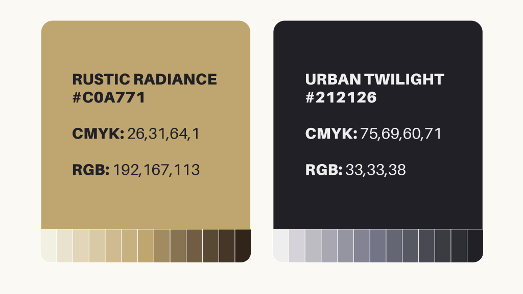
The trick wasn't just about providing entertainment, but living it, too. As a DJ, the founder was already doing this naturally. My role was to help him amplify his lifestyle to appeal to social butterflies of any age. So, instead of framing Touch N Spin as an events or entertainment company, I focused on moments, vibes and memories—things people could experience, belong to and rally around. I swapped corporate phrasing for a tone that felt warm, confident, and alive—like the people it speaks to. The goal was to create space for emotional connection, cultural relevance, and community. The visual Identity reinforced this energy. The logo resembles a vinyl record with an ambigram that spins to reveal the letters T, N and S. This nostalgic nod is a symbol of the lifestyle and shared experience it represents, connecting TNS to culture and music that spans generations. The colour palette, Urban Twilight and Rustic Radiance, mirrors that same duality: the electricity of nightlife and the warmth of togetherness.
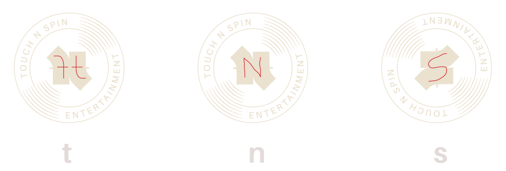
The visual Identity reinforced this energy. The logo resembles a vinyl record with an ambigram that spins to reveal the letters T, N and S. This nostalgic nod is a symbol of the lifestyle and shared experience it represents, connecting TNS to culture and music that spans generations.

The colour palette, Urban Twilight and Rustic Radiance, mirrors that same duality: the electricity of nightlife and the warmth of togetherness.
OUTCOME
I packaged the new identity into a comprehensive brand guide, giving TNS the tools to show up consistently across all touchpoints. We launched the brand with a set of banners, car magnets and event posters, ensuring the brand was not just visible but reflected the energy of the experiences behind it. Since the launch, TNS has gained visibility in both community and corporate spaces, showing the balance we set out to achieve.
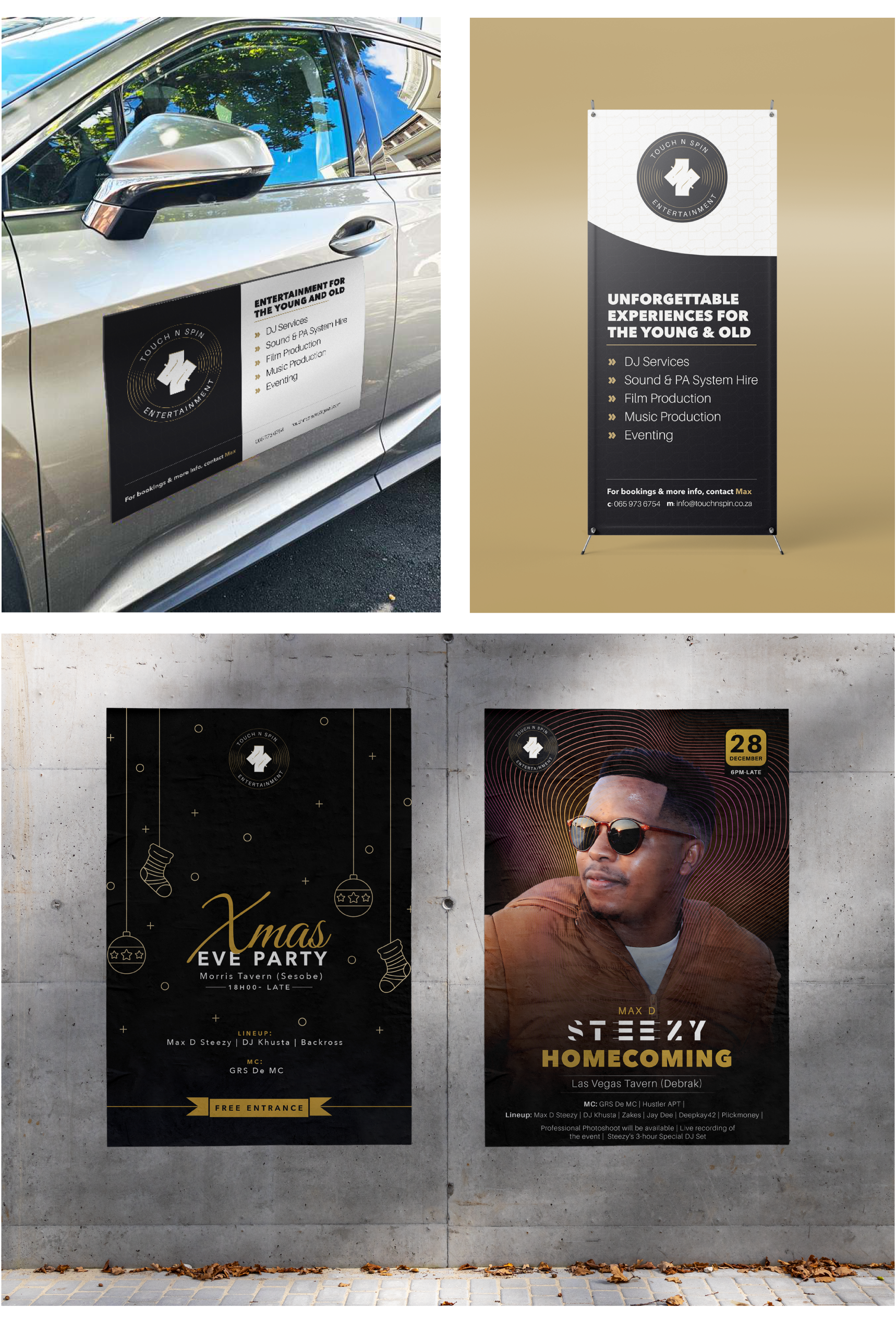
Since the launch, TNS has gained visibility in both community and corporate spaces, showing the balance we set out to achieve.