2022 - 2023
KVUNO REBRAND
KVUNO
Thato Mpshe
Brand Strategy · Message Architecture · Copywriting · Visual Identity · Brand Architecture · Collateral Design · Presentation Design · Publication Design
CONTEXT
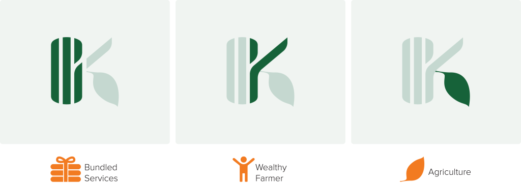
When branding in agri-tech, our visual language often focuses exclusively on agriculture and technology. In most cases, we overlook the very people these tools are built for: the farmers. 
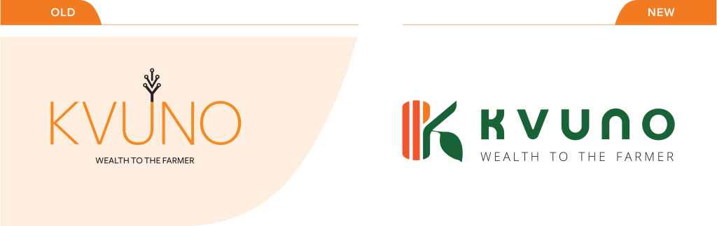
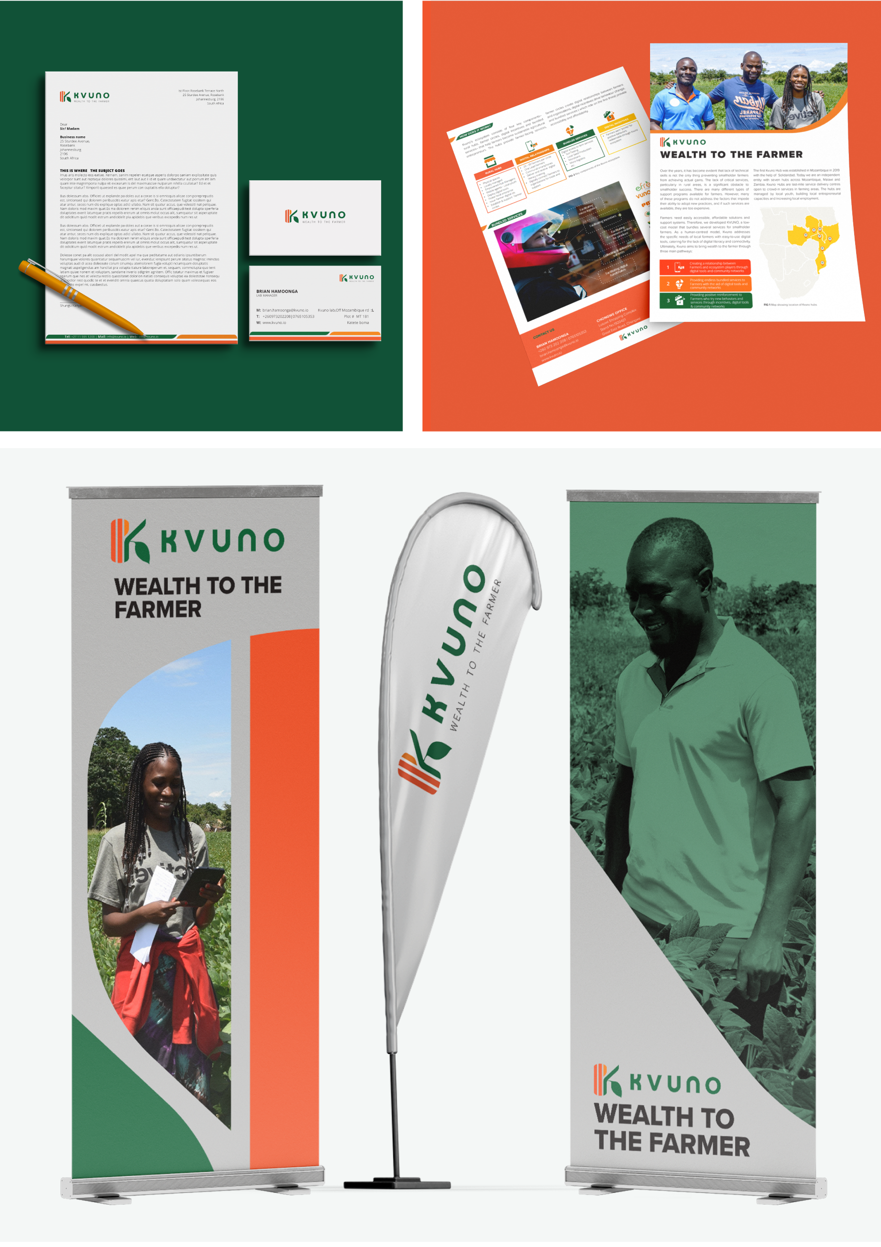
When Kvuno launched as a Solidaridad project in 2019, the goal was to tell a story about innovation: an NGO project providing digital solutions to smallholder farmers in Mozambique. And, as expected, its logo at the time leaned heavily into the “tech” narrative. When it was time to transition into an independent social enterprise, its mission expanded from just providing digital tools to creating sustainable wealth for small-scale farmers in Southern Africa. So, when the Kvuno team asked me to help them build a new identity, to reflect their new chapter and attract donors and other global partners, I had one question:
“How do you build a brand identity that speaks to farmers and still wins over global partners and funders?”
STRATEGY
The key was in understanding our audience. Donors and global partners are driven by a desire to improve farmers' lives. Farmers, on the other hand, need affordable agricultural tools and services that improve their productivity and livelihoods. Kvuno sits right at that sweet spot, deeply aware of the farmers’ challenges and equipped with the expertise to help global partners deliver effective solutions. This meant the brand needed to “show up differently” for each group. So, we embraced the duality: positioning the brand as the bridge, or translator between the two worlds. Kvuno has two distinct messaging frameworks: one to foster familiarity and trust with farmers, and another to show credibility and expertise to donors and partners. But we couldn’t have two personalities or visual identities without splitting the brand in half. Instead, we anchored everything in one shared brand personality that combines reliable expertise with a sincere heart and a hint of excitement.
To embody this personality, the visual identity balances Kvuno’s expertise in technology, agriculture and human impact in a way that both audiences could instantly connect with. The new logo is simple, memorable and deeply symbolic.
The colours reflect the brand’s spirit and purpose: Zestful Orange for Kvuno’s daring and innovative spirit, Bountiful Earth for soil fertility and sustainable wealth, and Foliage Green for thriving farmlands and a vibrant agricultural ecosystem.
Beyond the primary visual identity, we adopted a house of brands strategy, structuring Kvuno’s offering into distinctive sub-brands while creating room to bundle external offerings alongside its own without diluting the brand.
OUTCOME
I consolidated the new identity into a comprehensive brand guide. A practical tool that enabled the Kvuno team to manage future collaborations and present a consistent and unified brand beyond aesthetics. The guide’s clarity proved its value when the team approached an external supplier to develop Kvuno’s website.
We launched the refreshed identity with a range of collateral, including staff uniform, banners, brochures, and a pitch deck that helped the social enterprise secure a $ 1.5 million grant from the Bill & Melinda Gates Foundation under the Smart Farming Innovations for Small-Scale Producers Grand Challenge.
I continued to support Kvuno post-launch through ongoing design work until 2023, ensuring consistency and growth across new products and campaigns.